In-app feedback beats a feedback portal
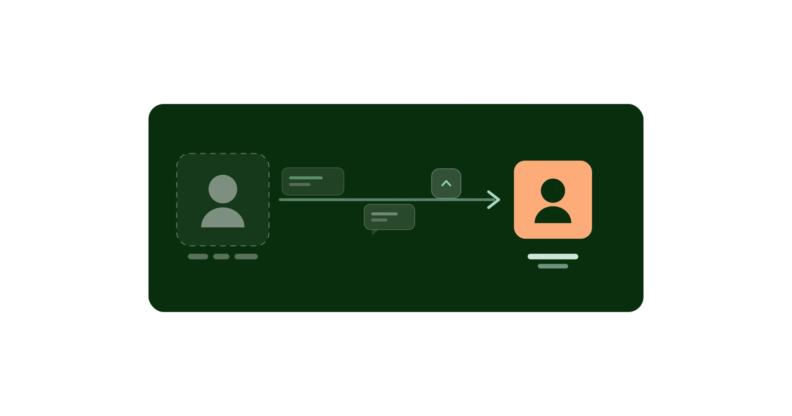
A portal asks users to leave your app, make an account, and remember why they were annoyed. Each step drops people. In-app skips all three.

A feedback portal is a website your users have to go to. That sentence contains the whole problem: leaving the app, finding the portal, creating an account, and reconstructing from memory the thing that annoyed them ten seconds ago. Every one of those is a place to give up. In-app feedback removes all four, because the feedback screen is a screen in the app the user is already holding.
This is an argument about mechanism, not a claim about measured results - see the note at the end.
Key takeaways#
- A portal adds four drop-off points: context switch, navigation, account creation, and recall.
- App store reviews are the default fallback, and they are the worst option - no threading, no follow-up, no private reply, no voting.
- The user who bothers to complete a portal flow is not a representative user. You get feedback filtered by persistence, not by importance.
- Voting is what turns a pile of requests into a priority order, and voting needs enough participants to mean anything.
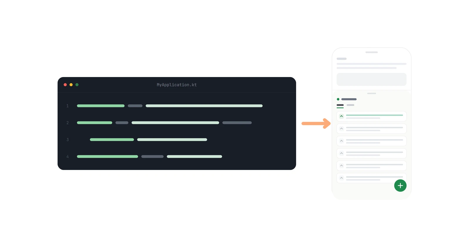
- In-app does not mean unstructured: fedo renders a full board - list, details, threaded comments, votes - inside the host app.
Where do feedback portal users drop off?#
The context switch. Sending someone to a browser means leaving the app. On mobile that is a real transition - a different app, a different session, a login state that does not carry over. Some users do not come back to your app afterwards at all.
The navigation. Finding a feedback portal usually means a settings menu, a "Support" item, a link, a page load. The gap between wanting to say something and having somewhere to say it is measured in taps, and taps are where people leave.
The account. Portals like Canny and UserVoice generally want an account before you can post or vote. That is one more form between the user and the sentence they wanted to write. For an app that has no accounts of its own, it is also an absurd ask - sign up for a third-party service to request a feature in a free calculator. (Canny specifically: see the fedo vs Canny comparison for how its mobile widget and tracked-user pricing work out.)
The recall. By the time someone has crossed the other three, they are describing a bug they saw a few minutes ago, from memory, without the screen in front of them. Reports get vaguer the further they are from the moment.
None of these are individually fatal. That is what makes them dangerous - each one looks like a small ask, and the compounding is invisible because you never see the people who dropped out.
Why are app store reviews a bad fallback?#
The realistic alternative to a portal is not "a better portal." It is app store reviews, which is what users do when there is no other channel.
Reviews are a bad feedback mechanism in a specific way: they are one-directional. There is no thread, so you cannot ask a clarifying question. There is no private reply, so the entire exchange is a public performance. There is no voting, so twenty people wanting the same thing looks like twenty unrelated complaints. And the star rating attached to each one means the user is choosing between helping you and hurting you in the same action.
You also do not control the format. A crash report and a feature request arrive as the same object, sorted by recency and helpfulness votes from strangers.
What voting is actually for#
The reason a feedback tool needs voting is that a list of requests is not a priority order. Fifty feature requests with no signal is a worse artifact than five with counts attached, because it looks like data while telling you nothing.
Voting only works with participation, which is the argument for in-app all over again. A vote is a one-tap action - exactly the kind of contribution that survives friction badly and dies completely behind a signup form. The users who will file a detailed request are rare. The users who will tap an arrow next to someone else's request are common, and they are the ones who turn a pile into a ranking.
This is also why anonymous participation matters: the SDK gives every user an identity whether or not your app has accounts, so voting works from the first tap. How that works, and what it costs, is its own post.
Is in-app feedback unstructured?#
The objection to in-app feedback is usually that it means a free-text box that dumps into an inbox. That is not what is being argued for.
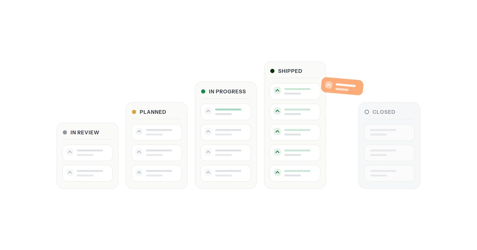
fedo renders a complete board inside the host app: a list with All and Mine tabs, per-item voting, a details view with threaded comments, and an editor with validation. Status moves through In Review, Planned, In Progress, Shipped and Closed, so the person who asked for something can watch it happen. It is the structure of a portal, minus the part where the user has to go somewhere. If you are weighing that against building your own, build or buy in-app feedback itemises what the homegrown version involves.
The developer side is a dashboard: every request, who submitted it, who voted, the full comment history, sorted by votes. That part is a web app, because it is for you, and you are not the one who needs to be caught in a five-second window of annoyance.
The honest caveat#
fedo is in early access and I do not have adoption numbers to show you. Every claim above is an argument from mechanism - friction compounds, one-tap actions outperform forms, context-switching loses people - not a measured result from fedo's own users.
I would rather say that plainly than quote an industry statistic with no relationship to this product. When there is real data, it will be its own post, including the parts that do not flatter the argument.
Comparisons against specific tools: vs Canny, vs UserVoice, vs Gleap. The SDK integration is two calls.